working with
fonts
fonts
The days of having to own a separate tray of type for each font, weight and point size are far in the past. Every owner of a PC has access to hundreds of fonts and the ability to space, align and manipulate at the touch of a button.
The use of different fonts can transform a document but there are a few simple guidelines to follow to ensure that you don’t have problems when submitting your artwork for printing and that your document doesn’t become difficult to read.
True Type & Open Fonts
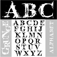
These are the files in which the fonts are saved in your computer. There are literally thousands of fonts. Never assume that a printer is bound to have the same version as you. The small selection supplied with the windows operating system are probably the only certainties. Different manufacturers produce their own versions of each font family as well as hundreds of companies and individuals producing bespoke fonts from the attractive to the bizarre
Westgate Print have a huge selection of fonts, the obvious MS Windows set, and the CorelDraw Bitstream Collection being the main certainties.
If you are sending a file containing fonts from any other source it will be necessary to either convert the type to curves, embed the fonts in a PDF document or supply the font along with your document. How to send us your font.
Printer and Type 1 Fonts
Be careful not to use Printer Fonts when submitting artwork. These fonts are resident in your printer and therefore cannot be used by us! Postscript Type 1 fonts are rarely used on PC now, do not use them when submitting artwork, stick to True Type or Open Fonts.
Missing Fonts
When opening a document do not ignore the missing font dialogue boxes. Allowing a program to substitute a font is very risky! All fonts have slightly different sizing and spacing, a substituted font will very often vary, meaning at best that the spacing on your page will be slightly out, at worst that the substituted font will be too large and that the text will physically not fit on the page or will protrude outside the text block and vital text will be lost!
A FEW POINTERS . . .
A FEW POINTERS . . .
Sans serif
Serif
A serif font is considered to be the most legible, particularly for long passages of text. A sans serif font is used for titles, headlines and shorter blocks of text.
Text is most legible in standard upper and lower case format.
LONG SECTIONS OF UPPER CASE SHOULD BE AVOIDED AS IT IS NOT AS LEGIBLE AND LOSES ITS EMPHASIS IF OVER USED.
Some Decorative Fonts are virtually unreadable in upper case and should not be used - people do - honest!
Type is measured in points. There are 72 pts to the inch but the height of individual characters in different fonts will vary.
Leading is the amount of space between the lines of type. It is normally measured in points or as a percentage of the point size being used for the text.
Avoid long passages of large text large just to fill your column or publication. This causes problems with line endings and does not look attractive. If you really are struggling to fill your publication perhaps you should consider less pages or panels. Don’t be scared of white space.
Consider using a smaller point size and increasing the leading to the fill the space, alternatively incorporate a graphic to illustrate your point or some boxes to emphasise certain areas of importance.
Using a combination of leading and paragraph spacing is a ways of spacing the text to fit the exact space available whilst keeping an appropriate font size.
Justified text is most legible provided the text is the correct size and the width of the column is sufficient. Hyphenation can be a problem, especially with lower end software such as MS Publisher which tends to split words in most peculiar places - be sure to check your hard copy and if necessary manually change hyphenation, decrease the point size, increase the width of the text block or consider ranging text left or breaking the paragraph down into smaller bulleted or framed points if applicable.
Ranged left text is less formal than justified text and is still very legible.
Centred text is ideal for short sections and headlines but longer sections of text should not be centred as it is not as easy on the eye as justified or ranged left text.
Use caution when adjusting the letter-spacing, the font designers generally know how their font looks best. Adjustment can be used for headlines etc. A very small adjustment can be used to help fit where space is at a premium or to add extra emphasis where required but too much adjustment should generally be avoided.
Avoid underlining sections. To add emphasis embolden or italicise text. Underlining was designed for the typewriter when these alternatives were not possible.
Use COLOUR with care - small or fine type may be difficult to read. Avoid using too many different colours it is confusing to the eye and looks like you’ve just been let lose with a new paintbox.

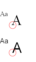
Cap-height
x-height

ascender


Add emphasis with reversed out text. To retain effect do not over use.
Choose your font carefully, nothing too fine.
Choose your font carefully, nothing too fine.
Tinted boxes are ideal for HEADLINES
Very fine fonts can be difficult to reproduce digitally and should be avoided when printing offset unless they are in 100% black (K).
One decorative font per publication is usually sufficient! Try to base a document around one font family.